One of the most powerful tools that exist in the design field is color. It can attract attention, evoke emotions, or communicate ideas, therefore you must take the necessary time to choose the more suitable color for the piece that you are creating. If you are in the stage of building your brand, at some point you are going to choose a color palette, and to define it is useful to remember what they want to convey and to whom. Then you can do a detail of how many colors you think that you are going to use, for example, background, color main, color secondary, etc. Now, how do you choose the right color?
The same color may affect two different people differently, besides the connotations in terms of color can vary from one culture to another. However, there are some parameters that you can use as a guide at the time of choosing your color palette:
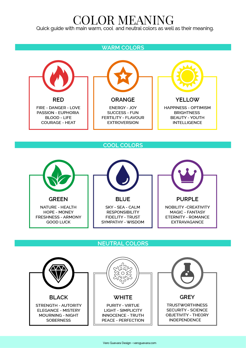
Warm colors:
They transmit energy, euphoria, and passion.
Red: It’s associated with fire and violence but also with love and passion. In design is a color that attracts a lot of attention. More brilliant reds bring energy and more dark ones elegance.
Orange: Is a color associated with energy and happiness. In design, it stands out without being as aggressive as red.
Yellow: Is the most brilliant of warm colors. And it is associated with the sun. You can use yellow to convey joy
Cool colors:
They transmit calm and professionalism.
Green: It symbolizes nature and health. The most brilliant Greens are more vibrant and the darkest give more stability.
Blue: It’s the color of the sky and the sea. You can use it if you want to transmit calm and responsibility. Clearer blues are refreshing and darker ones transmit wisdom and confidence.
Violet: It was formerly associated with the nobility. It is a color that will work very well if you want to transmit creativity, magic, or romance.
Neutral colors:
Usually combined with more vibrant colors their meaning is affected by these last ones.
Black: It’s the strongest of neutral colors. It can connote both strength and authority as elegance and mystery.
White: It’s the color of purity and virtue. In design, white can bring simplicity and light.
Gray: It’s associated with responsibility and safety. In clear shades, it can be used instead of white, and in dark tones, it can replace black.
The colors you choose will make people feel attracted or not towards your work. Remember what you are trying to transmit. Play, experiment, and try different palettes until you find the right one.