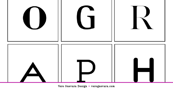
Typography. Whether you’re creating a logo or a brochure there is no way you will avoid working with typefaces and there are millions out there you can choose from. Well… I don’t know if there are actually millions of fonts but there are certainly lots of options which is a good thing… and a bad thing at the same time. Good because you have more chances to find a font that’s suitable for the content you’re creating. Bad because with too many options you have the risk of getting lost in a “typographical sea” and wasting a lot of time.
So I’m going to give you some tips that I hope will make your work easier.
Typeface vs. Font:
A typeface is a group of typographical symbols such as letters, numbers and other characters that will later allow us to compose words.
A font is actually the set of characters, on a specific style and size, of a typeface.
So, Garamond is a typeface and Garamond 12pt bold is a font.
Recognize the different kinds of typefaces:
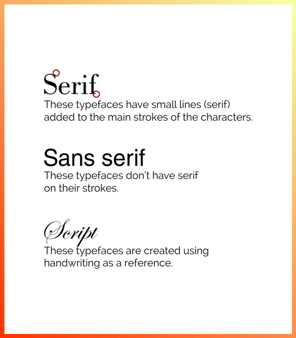
Even though we can get very specific in this area, to keep things simple we are going to organize typefaces in three main groups:
Serif: These typefaces have small lines (serif) added to the main strokes of the characters.
Sans-serif: These typefaces don’t have serif on their strokes and they usually look more modern than serif typefaces.
Script: These typefaces are created using handwriting as a reference and they are very fluid.
Keep it simple:
When trying to show the right “mood” we sometimes tend to use too many typefaces and that ends up creating a visual mess. Choose two typefaces and stick to them. You can try, for example, a serif and sans serif combination, and that will reduce the margin of error.
Designate a role for each typeface:
Choose one typeface to be your main typeface. That is the typeface that you can use, for example, on your logo or on a header.
Choose another typeface to be your secondary typeface. This last one can be used as a tagline so it needs to make a good combination with the main typeface.
Choose another typeface as your body typeface. In case you’re creating, for example, a brochure or a whitepaper you will need to have a body typeface and this one my friend, MUST be legible.
Play with contrast:
By pairing typefaces with different styles or widths you can make more attractive layouts. It can also make your piece more legible and clear for the reader. Keep in mind that if one of your fonts has a great personality, the secondary font should be more neutral.
Make sure that they work:
There are a lot of different pieces that you can create and not every typeface that you like will be suitable. Keep in mind what you will need those typefaces for and then choose typefaces that will easily adapt to those pieces.
More of an art than a science, working with typefaces can be time-consuming and although it’s fun (at least for me) I’m sure that you have lots of things to do for your business. Keep these tips handy, refer to them whenever you need to, and save time.